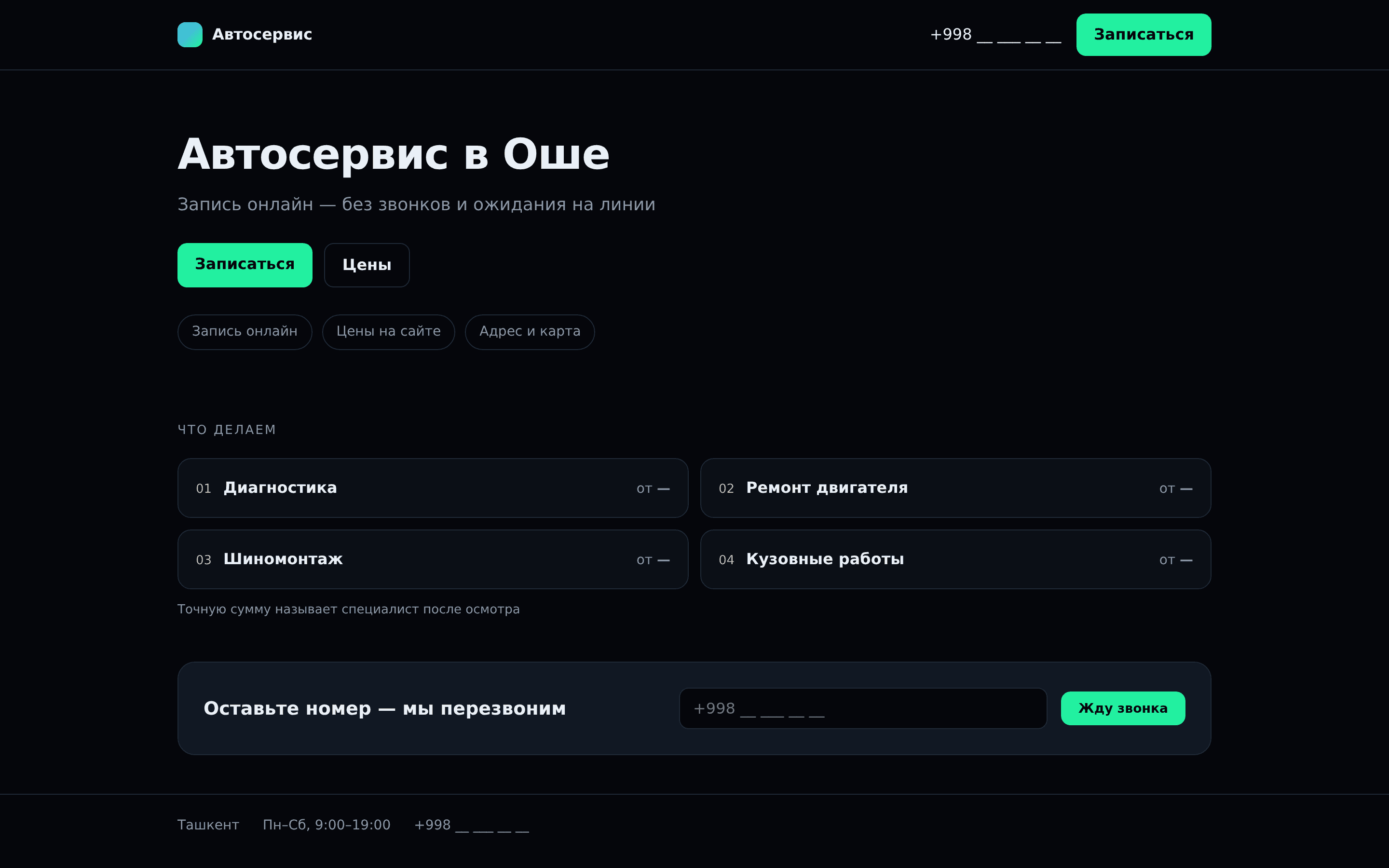
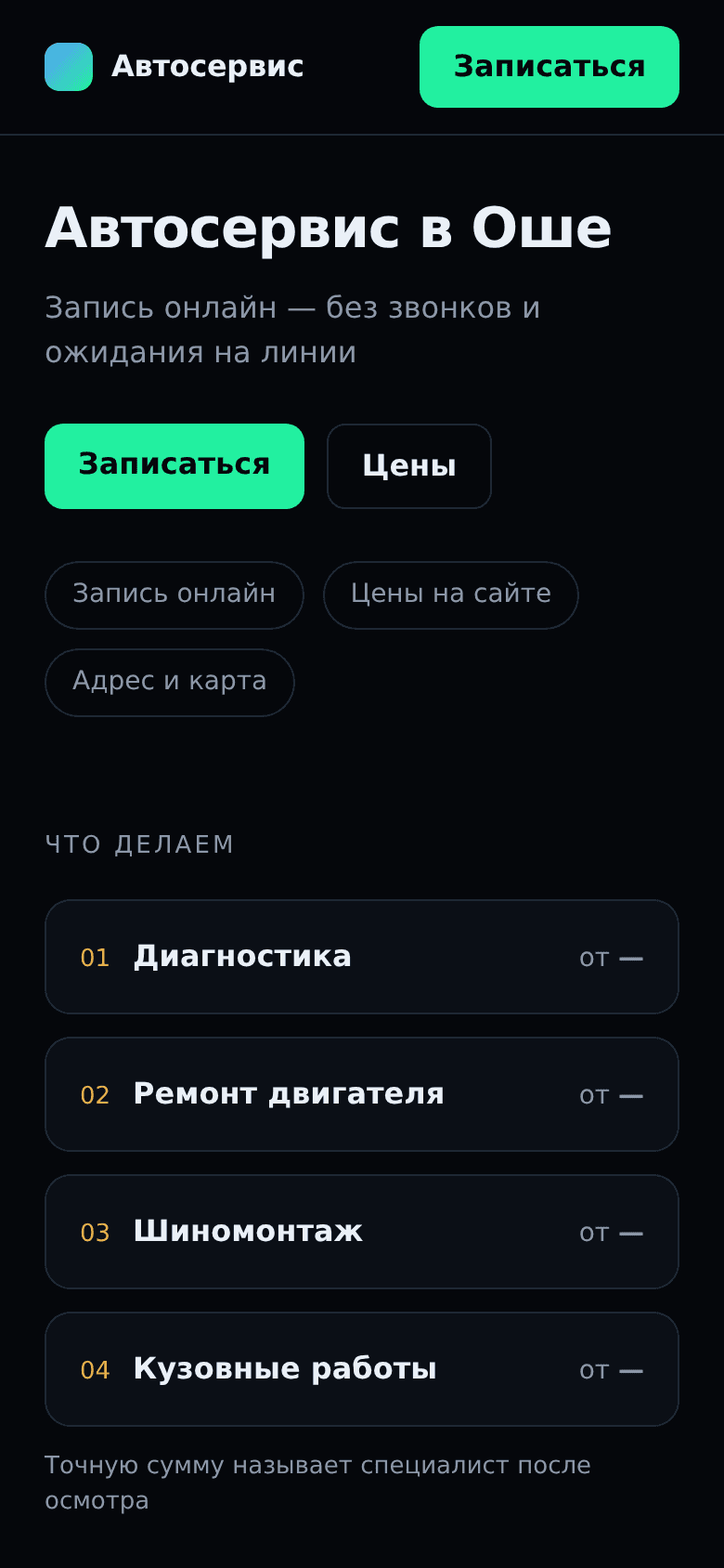
A car service business deals with customers who are almost always stressed: something broke, and they need it fixed fast, with clear terms. In this niche, a website isn't a showcase — it's more like a help desk: where to call, how much it costs, and whether you can message instead of calling. Today we're looking at a car service website in Osh from exactly that angle — not as design critics, but as someone deciding who to trust with their car.
We went through the site end to end: the homepage, the reviews page, the maintenance page, and three more sections — six pages in total. The technical side is fine: the server responds in 38 ms, so pages load instantly, and no visitor will complain about speed. But the overall score came out at 36 out of 100, and the reason isn't technical — it's that the site doesn't help a person take the next step: call, message, or even get a rough idea of the budget.
Below, point by point: what a visitor sees at each step, and where they most likely turn back and go to a competitor instead.
What this gives
With the phone number visible and a messenger button right next to it, every visitor ready to reach out now can actually do it — instead of searching for a way to connect and giving up before their turn comes.
A price range for the main services filters out random inquiries and brings in people who can afford the service and actually need it — fewer empty conversations, more bookings for repairs.
The technical fixes around languages and page addresses help the search engine show the site to the right person in their own language, instead of splitting visibility across duplicate pages.
Subheadings and text structure keep people who've started reading on the page, and carry them through to a call or a request, instead of a closed tab.
For a site of this size and this set of fixes, DevUz Studio's ballpark is from $2,500, 3-8 weeks.
We do not name the company or link to it. This is about typical mistakes, not specific people; the name and logo on the screenshot are covered.