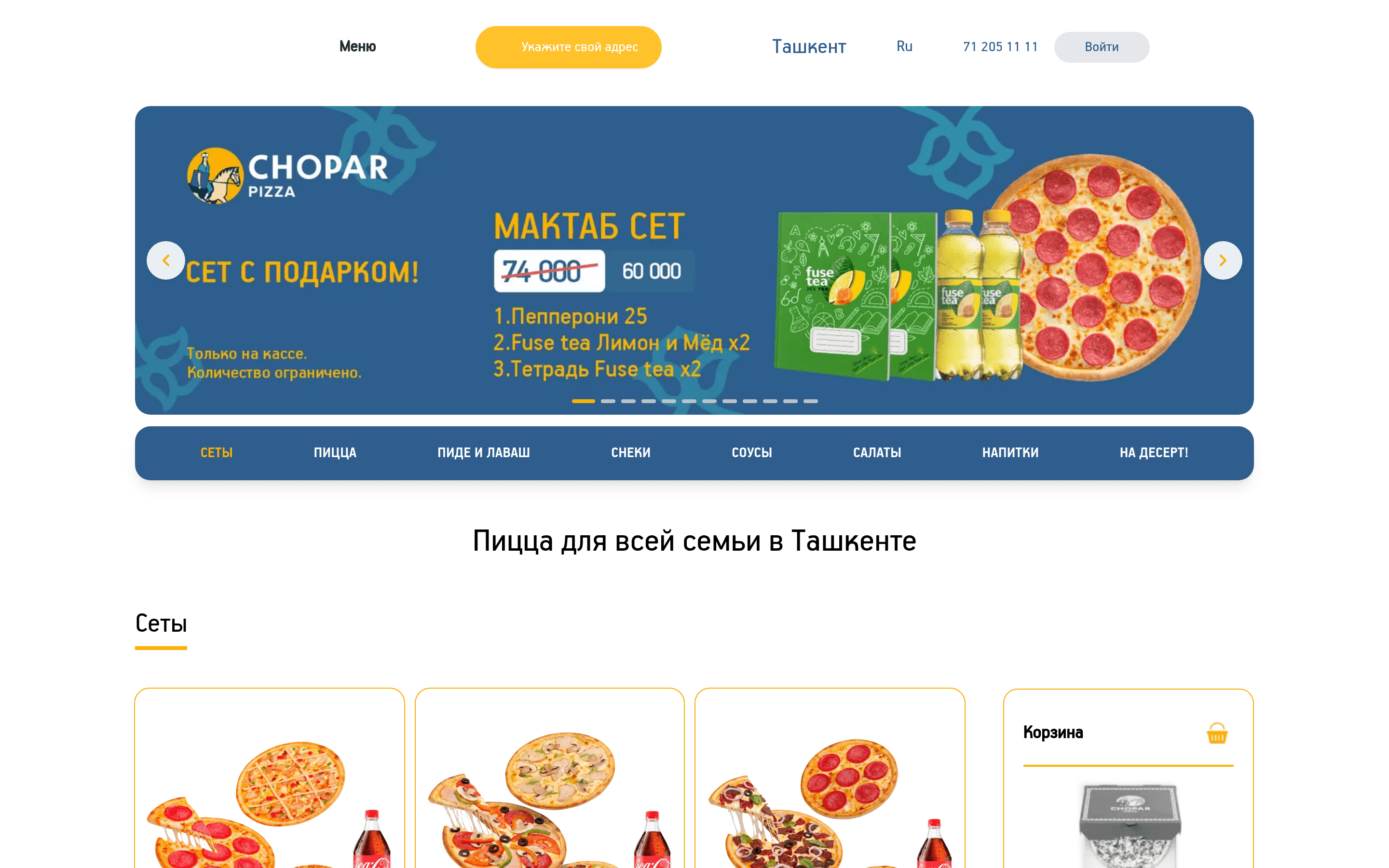
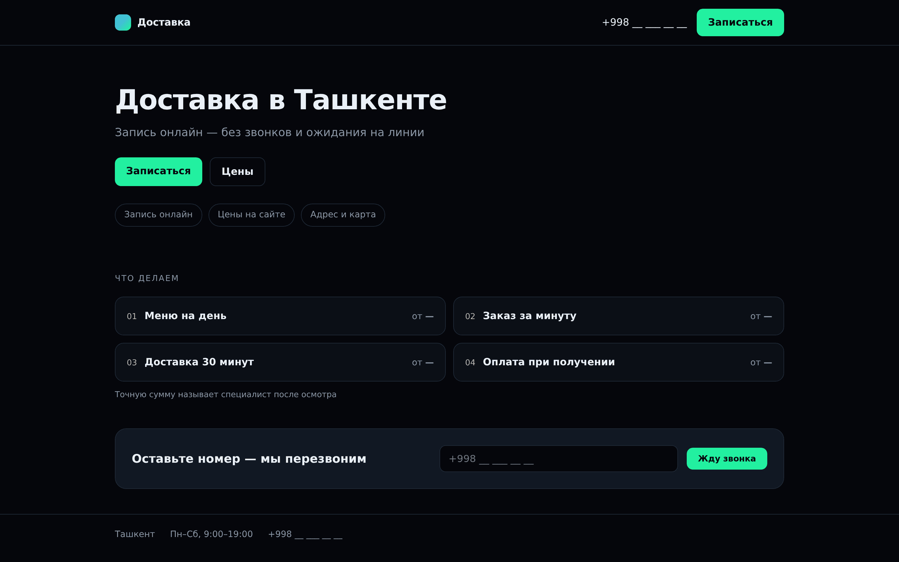
Here we look at the website of a food delivery service in Tashkent. The service is simple: a hungry person opens the site on their phone and wants to place an order as fast as possible. For a food delivery website in Tashkent, or anywhere else, there are only a few seconds to convince the visitor that the order will go through and the meal will actually arrive.
On the technical side, the site is in good shape. The overall audit score is 88, and the server responds quickly: time to first byte is 310 ms. Speed is not the problem here, and there is nothing to fix. The problems lie elsewhere: in what the visitor sees and what they can do on the pages.
We are taking apart this particular site because the same picture is common among delivery services. The site is fast and tidy, but nobody is guided anywhere, and there is nothing to convince a visitor to order. Below are four findings, ordered from the most costly in consequences.
We do not name the company or link to it. This is about typical mistakes, not specific people; the name and logo on the screenshot are covered.